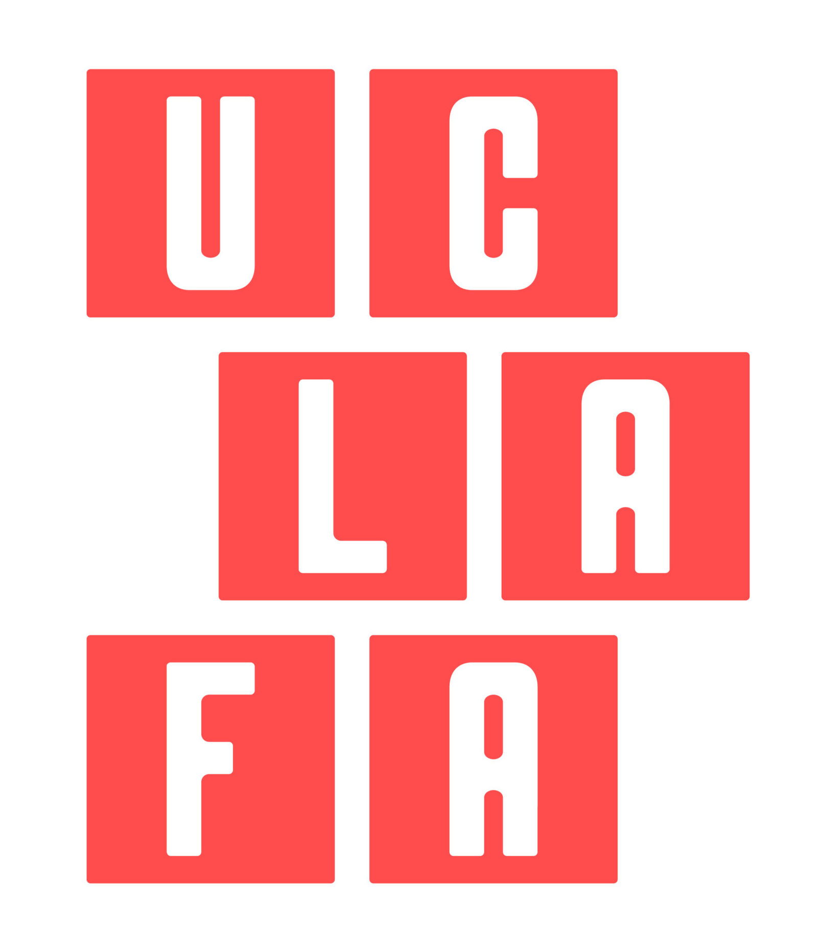
Hindsight on yesterday’s post on the new UC logo; did we get our money’s worth?
…(T)he new design… was created by an in-house design team at no extra cost to the university.*
*From Los Angeles Times blog,
HEADLINE:
“Critics say new UC logo is not dignified enough,” 12/8/12:
Source: http://latimesblogs.latimes.com/lanow/2012/12/critics-say-new-uc-logo-is-not-dignified-enough-.html
As the headline suggests, there is an issue about dignity. An observer (who will remain unnamed) has pointed out to yours truly that the new logo, when turned upside-down, resembles the rear end of an elephant.
If – despite the controversy – UC decides to stick with the new elephantine logo, it might also consider developing an official song. A modest proposal: There is already a song available that could be adapted:
[youtube http://www.youtube.com/watch?v=e3NeQfiKHgg?feature=player_detailpage]


